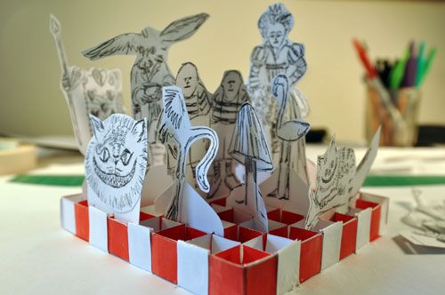
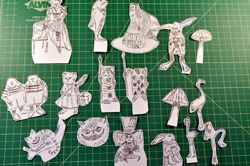
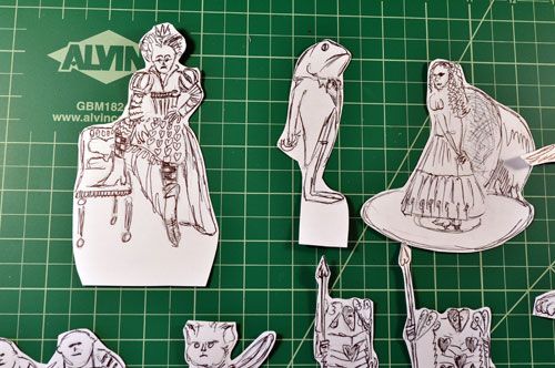
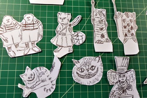
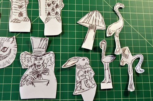
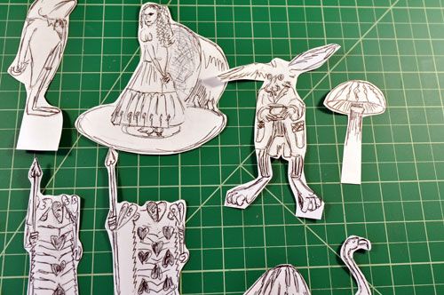
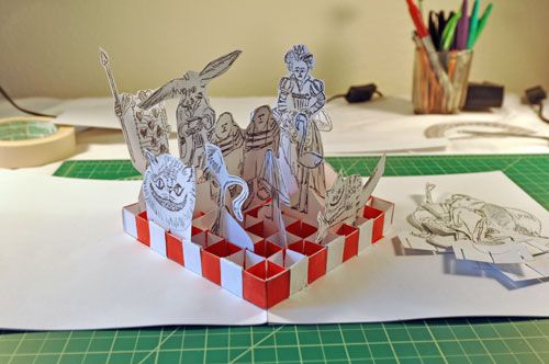
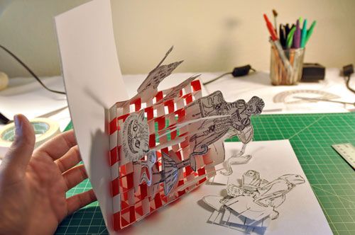
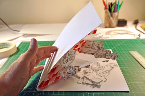
| This is a birthday card for a friend. The theme is Alice in Wonderland in the style of Tim Burton. The characters are scratchy ink sketches on one side only. The original pictures are wildly colorful and the original sketches for this card were also colored, but honestly, after four iterations in various sizes I got tired of coloring the figures so the final version is plain black and white sketches with no color fields. The characters fit within a three dimensional paper grid as chess pieces made of paper. The grid is fashioned from slats with alternating slots. Each slat is cut with slots exactly the same half way through. Half the slats are inverted so that half the slots face up and the other half face down. The slots are matched, 50% upward slot matched with an inverted 50% downward facing slot equals 100% of total slottage at the point of intersection of two slats, the point, of course, being a line. So there is the grid made of slats, the kind of slats that would protect bottles packaged together in a cardboard case. Those cardboard protective inserts always fascinated me. The way they collapse. Collapse. Open. Collapse. Open. Collapse. Open. Collapse. Open. Collapse. Open. Collapse. Open.The idea of a 12 section grid designed to protect bottles suggests a 64 section grid for a chessboard. The way they collapse and open again suggest a way that a smaller version of the elaborated grid can be inserted inside a card. |
 |
 |
 |
 |
 |
 |
 |
 |
 |
 |
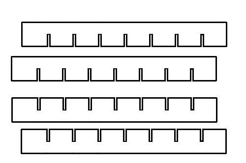 |
| Seven strips with slots facing up cross with seven slips with slots aiming down. With the ends extended so that boxes are formed on each end, all four ends, The grid can be fitted with an outside frame. Two sides of the frame will be attached to the card, the other two sides are free, along with the entire inner grid is also free, only the two sides of the frame for the grid are attached to the card. This is what is so visually extraordinary about the action that comes from opening the card. An entire grid comes flying out of the air and plunks down upon a tiled floor and forming a perfectly square grid. |
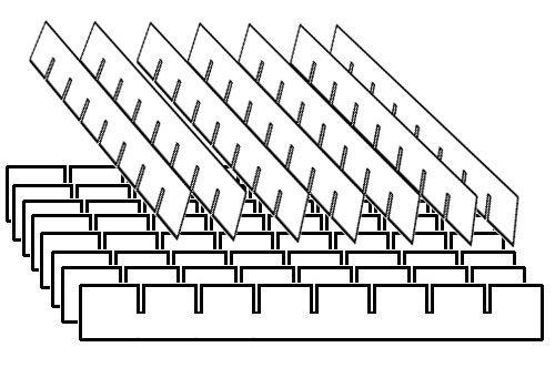 |
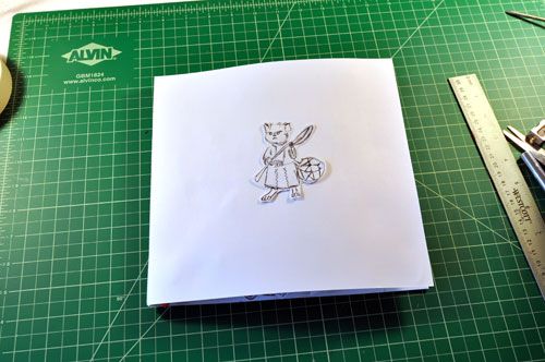
| So that is the basis of the grid. The grid is attached to the card along the central fold, the two sides of the frame for the grid set at precisely 45° angle. Earlier versions used larger squares for the grid. The entire grid did not fit folded inside the closed card no matter what size paper was used. For one inch squares, a portion of the grid had to be trimmed off in order to fit the largest card stock. The bit that is trimmed off in order to force fit the content into the card actually results in an interesting changing pattern. The result is an incomplete grid that fades out from three dimensions to two dimensions to nothing as if disappearing in the background. But in this case the squares were made smaller in order to have a complete grid that fits inside the dimensions of the largest card stock reasonably available. Would you really want a gigantic card just to have a complete 8" X 8" grid inside? The rest of the content would have to be very interesting to make the grid worthwhile, after all, the grid is basically a floor. The character pieces can be lifted out of the grid. Extra characters are placed in a pocket occupying a portion of negative space in the background outside of the grid. Each character piece is fitted with a 3 slot tab on the bottom, so that even the thinnest piece straddles three grid sections and with their slots the pieces fit through the grid and fold along with it. So the character pieces can be changed. The cover is one of the characters glued to the front. There is no special envelope. The Postal Service mailer will have to do. That is how lazy I've become. *hangs head in shame* I drew the characters covering three pieces of card stock. On the third page I thought, "Okay, that's enough already," even though there are plenty more characters that could have been drawn. When it came time for the cover I was totally over drawing Alice in Wonderland characters so I used one that was already drawn. |
Alice in Wonderland pop-up card
Subscribe to:
Post Comments (Atom)
No comments:
Post a Comment